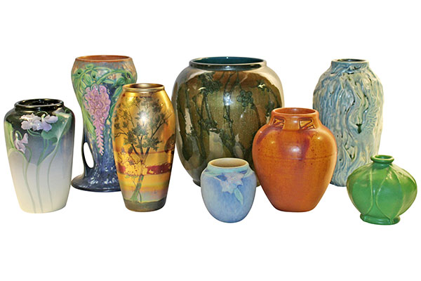
Rookwood Pottery Aerial Blue

Produced for just one year, between 1894 and 1895, the Aerial Blue pattern has a beautiful translucent gloss with grayish-blue hues throughout. What’s so surprising about these patterns is often, the blue that comes through isn’t a result of the painting, but rather, the blue found naturally in the clay. Of course, it’s accentuated, but rarely is a pottery piece created with its natural elements as part of the design process. It’s truly a remarkable collection and even more surprising is it was discontinued after just three months. While there aren’t any definitive dates, it’s believed production began in November or December and by January or February of 1895, it had been discontinued.

It’s important to keep in mind that there was a lot going on with Rookwood Pottery during this time. It had already been considering, and indeed experimenting, with the Cameo ware with the goal of creating lighter design colors to pair with those thick, glossy and translucent glazes. In the middle of all this, the facilities – the entire company – relocated to a better area. So, between the ongoing new product development and the physical move, it could have been the Aerial Blue line got lost in the process.

Other factors included the introduction of the Sea Green Iris glaze lines, simultaneously offered with the Aerial Blue. Also, because the Aerial Blue was at least partially inspired by another company’s line, Royal Copenhagen, the two could have been in an informal competition with the competitor’s offering winning customer loyalty. Either way, this simply wasn’t a popular line. Perhaps it was just ahead of its time because it’s one of the most sought after Rookwood Pottery glazes today.

If you’re looking for markings, you should know most of the pieces include those exclusive to Joseph Bailey, the company’s long time ceramics engineer. They’re described as “an impressed number – usually three digits – bracketed by incised crescent moons, found usually on the bottom of these pieces”.

If you’re a Rookwood Pottery fan, this is truly one line that is indicative of what the company was always about: beauty, elegance and attention to detail.

StumbleUponShare

Roseville Pottery Orian

The middle period line that’s all about vivid colors and a rich gloss glaze is Roseville’s Orian; curiously, it’s also one that’s often overlooked. Considered art deco, this contemporary collection offers those vibrant colors this time period is known for and certainly presents the willingness to take a risk that Roseville Pottery was known to do.

In the mid-1930s, during the height of its popularity, it was referred to as a “solid color line that is a real achievement in ceramic art…inspired directly or indirectly by the Chinese vases of the Ming period”. It was also noted for the unique contours and glaze combinations. It’s interesting, too, that while trying to grasp the right adjectives for this post, I ran across an apt description related to the designs: “shapes are lovely but in no way extreme”. That’s true, too – they’re unique and and certainly creative, but we’re not talking on the level, of say, the aggressive designs George Ohr was known for. The result is a fun presentation of narrow handles, wider vases and pedestal bases – lots of pedestal bases.

It’s believed there were sixteen shapes with this Roseville pattern – and they’re all beautiful choices. If you run across them, and if you’re an art deco fan, odds are, it’s going to be difficult to pass up. There are several vases in a wide range of heights, widths and glaze colors, along with bowls, candlesticks, wall pockets and even a lovely rose bowl.

You’ll recognize the Roseville Orian. Look for the glossy finish, smart color combinations (one favorite is the yellow and green that really makes the vases stand out). Also, those narrow and usually low resting dual handles are generally a giveaway along with the classic “pedestal base”. While there are several tan pieces, they’re not likely to sell for as much as their more colorful counterparts. Also, note that in the bowls, the interior of the actual bowl is usually white, which is a nice contrast with the reds, greens and yellows on the outside of the pieces.

StumbleUponShare

Roseville Pottery Florals: Roseville Sunflower, Water Lily

There are countless patterns, glazes, shapes and color combinations that define the Roseville Pottery as a whole. One of those themes is the creativity and elegance found in those lines of florals. Some are definitive, such as the Roseville Sunflower or Apple Blossom collections and others are a little less obvious, such as those sometimes found in Roseville Crystal Green, which, incidentally, remains difficult to find.

We thought we’d explore two of the more recognized Roseville Pottery lines: the Roseville Water Lily and Roseville Sunflower. There are a few similar features, but for the most part, each is quite distinctive in its own way. For instance, the Roseville Sunflower patter is considered middle period collection, as it was introduced 1930. The Water Lily pattern was unveiled in 1943.

Roseville Sunflower

Easily distinguished by the golds in the sunflowers and often with a green foundation, the Roseville Sunflower pattern is really quite sought after – from the time it was introduced until modern day, it’s often which serves as a striking complement to those vivid oranges and gold in the raised sunflowers.

It enjoyed a surge of popularity in the 1990s, and as a result, its value increased, too. If you’re looking for markings, because paper labels were sometimes used, it might be you come across a Roseville bowl or vase with no marking. There were some that had hand written shape numbers, which can help with identification. Many of the pieces had dual handles, which certainly adds to the overall presentation. A few of the examples of Sunflower pottery include umbrella stands, wall pockets, and of course, bowls and vases.

Roseville Water Lily

As mentioned, Water Lily is one of the newer lines and was introduced in 1943. Its standard colors are brown, blue, and pink, which blend in a beautiful manner. Like Roseville Sunflower, the Water Lilly also has several vases with two handles. Part of the draw to this particular pattern are the unique textures. The florals are raised and the smooth matte finish works to really accentuate the design elements. This Roseville Pottery pattern includes vases, bowls, bookends, ewers, jardinières and others.

StumbleUponShare

Fulper Pottery: Backstory

Even though Fulper Pottery was incorporated in 1899, it had roots that went as far back as 1814, albeit under a different name. The Flemington, New Jersey company was first the brainchild of Samuel Hill. He too called New Jersey home and was a well respected producer of crocks, jars and drain pipes. Hill passed away in 1858 and before long, Abram Fulper decided to begin purchasing as many of Hill Pottery pieces that he could get his hands on.

Fast forward to 1899 when the company was incorporated. William Hill Fulper II, Abram’s grandson, transitioned into the role of secretary and treasurer of the company. His Princeton University education served him well, especially as the company continued to grow. It wasn’t until 1909 that the now-Fulper Pottery Company released its first line, known as Vasecraft. It was more of a minimalist line; quite casual, yet lovely.

Within a year of Vasecraft’s release, another prominent employee, Martin Stangl, found himself in the role of ceramics engineer and soon was developing many of the glazes Fulper Pottery is so well known for. Another prominent name associated with this art pottery company is John Kunsman. He too preferred the simple glaze colors. His work found its way to the Louisiana Purchase Exposition where it earned an honorable mention. There were approximately 100 glazes used during the course of the company’s production. It wasn’t until 1929 that Stangl bought out the Fulper family, and unfortunately, he opted to compromise both quantity and quality. Within five years, the company was producing most dinnerware.

What we’re left with is some of the most striking art pottery to be found anywhere. If you’re already a collector, you know the glazes are often what sets this line apart from all others and if you’re new to the Fulper Pottery collections, you’re in for a treat as you explore those many glaze lines.

Be sure to explore the Just Art Pottery Fulper Pottery page. We have several pieces available, including the Fishing Man Statue, which is a favorite among collectors.

StumbleUponShare

Just Art Pottery Bargain Bin

Have you checked out the great finds in our Bargain Bin? This is a great opportunity to add to your art pottery collection or if you’re new to this particular art sector, it’s the best place to start. Check out a few of the latest additions to the bin -

Drawn to the more whimsical side of American art pottery? Then the Abingdon Pottery cookie jar is probably just what you’re looking for. This sweet Miss Muffet, who’s resting on her tuffet, dates back to 1949-1950 and is mint condition. The bottom is marked and this cookie jar measures 9 1/2″ tall and 8 1/4″ wide.

The Coors Pottery blue handled vase is a perfect example of how less is sometimes more in art pottery. The blue glaze on this double-handled vase contrasts nicely against the white glaze on the inside of the vase. It’s in excellent condition and measures 6 1/2″ tall and 7 1/4″ wide.

The unique presentation is what sets this Haegar Pottery Marigold Agate Earth Wrap Vase apart. The rich sunflower gold and yellow hues are a powerful base against the contrasting red and brown that present as abstract designs. It’s modern look and one many collectors are drawn to.

Hull Pottery remains one of the most recognized names in the industry. The Hull Pottery bow knot blue wall pocket is just one reason why. This design has a beveled handle, two side pockets and pink flowers with soft green leafing efforts. It’s a little vintage, a little traditional Hull and a lot of style. This is one that can be difficult to locate, so if you’re contemplating adding this to your Hull Pottery collection, now’s the time.

Speaking of vintage, there’s also a Rorstrand 1960s Swedish Titus art deco vase. This vivid vase offers a glossy finish against a rich blue and hues of brown. The lighter base color works well with both the colors and general design. It’s handpainted and is 6 1/4″ tall and at its widest point, measures 6″ wide.

These are just a few of the many gems you’ll find in the Just Art Pottery bargain bin.


StumbleUponShare

Avoid Buying Fake Roseville Pottery

One major reason people avoid collecting American art pottery is because they fear not being able to differentiate between fakes and true Roseville Pottery.

The truth is, some of the fake Roseville pieces have a sense of authenticity that makes it difficult to tell apart from true Roseville Pottery. Aside from getting your collection appraised (which we always strongly encourage), you may never know for sure. Then again, there are those who see the beauty and would still purchase it, even if it were a fake, so that

Collection of Roseville Baneda

they could display it in their home. There’s nothing wrong with that, of course, except you probably paid Roseville Pottery prices for fake Roseville pieces.

For those who find it difficult to tell apart, there are a few tell-tale signs that might clue you in. Keep in mind – this is all very subjective in that what one’s idea of a “dull glaze” might be different than another’s – again, this only reiterates the importance of a professional appraisal.

Take a look at the glaze on your piece; fakes lack a certain depth and without a “clear” look; it can even look dull and flat. Also, the glaze shouldn’t hinder the nuances of clay underneath it.

Take a look at the handles (if applicable). Fake pieces usually have bigger handles in terms of their dimensions. Again, this is subjective, but for those familiar with this line of art pottery, the differences are obvious.

How about the detailing? Authentic Roseville Pottery offers a lot of detail – the vines, florals, etc. The Roseville artists always took pride in their detailing efforts.

There were many Roseville marks through the years; so many that sometimes even collectors question a Roseville marking. There are those with Roseville U.S.A. or wafer marks or ink stamps – the marking often dates your Roseville piece; however, fraudsters will do their best to replicate the markings in order to fool buyers.

So what should you do to keep from being taken? We always tell customers to study their Roseville pieces they know are authentic. Usually, once you know what truly is real, the fakes become easier to identify. It’s also a great way to learn more about the history of this dynamic line of American art pottery.

If you’re looking to have your Roseville Pottery collection (or any other collection) appraised, give us a call. All of our appraisals are done in accordance with the Uniform Standards of Professional Appraisal Practice (USPA). Greg Myroth is a member of the Association of Online Appraisers and abides by the AOA Code of Ethics. For more information, visit our Just Art Pottery appraisal page.

StumbleUponShare

The Talent Behind the Grueby Pottery Name

Most American art pottery companies, especially at the turn of the century and then again during the Great Depression were all too familiar with cultivating talent, only to lose that talent to the competition or because the talent was needed elsewhere – even if that “elsewhere” had little to do with the art pottery sector.

This week, we take a look at some of the best talent that at one time or another called Grueby Pottery their employer. We start with none other than William Henry Grueby.

Grueby hadn’t shown much of an infinity for tiles or other art pottery in his youth; instead, he had to find a job – any job – when he left school in 1882. That job would be a CA Wellington an Co., which specialized in decorative arts. Eight years later in 1890, Grueby and a friend he met while working at CA Wellington left to form their own company. That friend, of course, was Eugene Atwood and the company was aptly named Atwood and Grueby.

Eugene Atwood

Atwood remained with Atwood and Grueby until 1894. It was then he decided to strike out on his own. His company produced architectural faience and enameled bricks. Six years later, Atwood Faience found itself in reorganization and eventually new management took over. When that happened, it was renamed Hartford Faience.

There was also a third partner, though his name was never on the letterhead. William Hagerman Graves had graduated college more than a few times and continued to rack up degrees when he was approached to serve as treasure to Atwood & Grueby. As far as most historians believe, Graves had created a single piece of Grueby Art Pottery – a blue bowl that was inspired by Japanese influences. Eventually, he left the company and went to work for a tile company.

Karl Langenbeck

Langenbeck was a brilliant man who had received significant training in chemistry, which he put to use when he was approached in 1908 by Grueby Faience to work out “technical problems”. Langenbeck is one of those talents mentioned above – those who come and go. He’d already worked for Rookwood Pottery of Cincinnati in the role of a glaze expert in the late 1800s.

Finally, we take a look at one of those creative minds behind the Grueby name. Ruth Erickson created a beautiful fern handled vase. So unique was it that it was exhibited at the Newark Museum and then a year later, in 1911, the museum purchased it to have on permanent display. Erickson also was the talent behind several of the Grueby tobacco jars. If you have any, you might notice a marking of 1/21/01 – one not familiar with art pottery might wrongly assume the marking is indicative of 2001, which, of course, is not so. Most of those tobacco jars were made in 1901.

The talent and business minds who defined this art pottery company were many. Some were around for the long haul, while others made contributions and then moved on. Regardless, what we’re left with today is a versatile and beautiful line of American art pottery.

StumbleUponShare

Rookwood Pottery’s Mississippi Connection

Rookwood Pottery is truly one of those American classics – not only in terms of art pottery, but in its totality as a business model. It survived the Great Depression when companies around the nation were folding. It’s undergone many changes in ownership, barely missed being sold to international buyers and through it all, the talent that is Rookwood Pottery continued to turn out some of those most beautiful collections the art pottery community has ever known.  What many people don’t know is that Rookwood Pottery temporarily relocated to Starkville, Mississippi in 1959. The ownership had just changed hands once again and even though the company had survived those difficult years in the 1930s, it struggled for many years after the Depression. The move to Mississippi was designed to put the company back at the top of its game. Unfortunately, it was unable to do so and as a result, folded (albeit temporarily) in 1967. At the time, no one knew for sure whether this American pottery company would be able to make a successful comeback.

Rookwood Pottery now calls Cincinnati home. It was purchased in the early 1980s by an in Ohio physician. Upon learning that Rookwood might be relocating to another country, Dr. Arthur Townley made his decision. He moved fast and indeed, invested all of his savings, in a bid to keep the company here in the U.S. This was in 1982. More recently, Rookwood Pottery was moved yet again to the Cincinnati area – on Race Street to be specific -and in 2006, Dr. Townley agreed to sell his assets, which included trademarks and even glaze recipes. This was surely a difficult decision for the dentist, but for the same reasons he purchased the company all those years ago, he believed it was the right thing to do.

Regardless of what ultimately happens with this company, there is no denying the indelible mark it left on the art pottery world as a whole and our society. Rookwood Pottery continues to increase in both its value and the number of those who are just beginning to see what many have known for decades.

StumbleUponShare

Incorporate your Roseville Pottery into Holiday Celebrations

Too many times, we find ourselves scrambling to locate the ideal centerpiece for our family gatherings, especially those special Christmas dinners that we want to ensure are absolutely perfect. As we run from florist to florist or department store to department store, we often overlook the beauty that’s already in our homes, courtesy of our American art pottery collections.

If you’re a Roseville Pottery fan, you already know how versatile your collection is and while there’s not definitive Roseville collection designed especially for Christmas, there are choices within the various collections that can really set the tone for your holidays.  The best part is that you don’t necessarily need a traditional red and green Christmas theme (although there are a few choices that match those color themes). A beautiful Roseville vase with hues of winter white or evergreen works well with silk Chrysanthemums or other holiday floral choices.

As mentioned, there are a few Roseville Pottery pieces that do have a more traditional Christmas theme. The Roseville Creamware collection offers holly-inspired designs. There’s a unique side-pour pitcher with vivid reds and greens against an off-white base. This would make a remarkable centerpiece with the right floral arrangement. Allow the colors to play off each other and you’re sure to have a finished look that’s nothing short of inspirational. Also in this line is a fern dish. This is another beautiful choice, partly because of its footed design. It adds a bit of height, too, which is what most of us like in our centerpieces. If you don’t already own any of these pieces, keep your eyes open – you never know when you’ll come across this particular Roseville design and once you do, it’s sure to be a new addition to your collection.

Another unlikely, though elegant choice for Christmas is found in the Roseville Corinthian line. Granted, it’s probably not the first thing you think of, but the deep green hues in the grooves of the pieces has a certain holiday feel. There are small berries, similar to holly, that coordinate nicely, too. It’s Italian inspired, so you know it’s all about the detailing and this Roseville line doesn’t disappoint.

If you’re not in possession of any of these pieces, remember Roseville Pottery has several lines that incorporate rich reds and brilliant greens. Even those Roseville pieces that don’t have a lot of height can be transformed into the perfect showcase for a bouquet of fresh mistletoe and of course, the other traditional Christmas flowers.

Remember, it’s all about the creativity. The subtle – and even not-so-subtle – Roseville designs makes it easy to allow that creativity to take over.

StumbleUponShare

The Unusual Faces in American Art Pottery

Most of us think beautiful florals, dramatic etching efforts and stunning glazes when discussing American art pottery. But this art form isn’t without its unusual pieces.

The Faces in Art Pottery

Art pottery is defined by numerous companies and artists, each of whom brought their own unique take on this line of art. Many artists mastered the beauty of detailed florals, others were experts in glaze lines and shapes. There were those rebels, however, that brought to the table anything but a “flowery” finished look. Many think of George Ohr whenever “rebel” and “art pottery” are used in the same sentence. But there were other streaks of eclectic lines that dot the landscape. Think faces and busts. They’re all quite dramatic and always the conversation piece of any collection.

Weller Dickens Ware, 2nd Line

It’s difficult to find the right adjectives to describe many of the pieces in this line of Weller Pottery. Unusual, exciting and some might say a bit disturbing; not that “disturbing” is used in an insulting manner, it’s just that the tobacco jars that take the shape of very detailed men’s faces can be a bit offsetting.

“The Skull”, as one of the Weller Pottery tobacco jars is called, has no eyes, though appears to be smiling. It can be a bit of a jolt. It’s believed there are three in existence and their value goes up considerably if you come across one with a finial that is a miniature skull. Another interesting face or bust is found in “The Turk”. The detail is very life-like with a permanent snarl on the fellow’s face, deep-set eyes and flared nose. The dark gloss adds to the dramatic presentation.

Also in this line you’ll find “The Irishman”. Most likely, there exists an “R.D.” as the signature. This guy has an upturned nose, heavy eyelids, lines around his mouth and thick eyebrows. Let’s just say he’d make a fine addition to your Halloween décor – as long as you keep him in a safe place as his value is considerable.

This is just one line of many that include very detailed faces. It speaks volumes of the talent these artists possessed and talent that they were willing to pour into their creations, unlike many of the manufactured pieces we see in a more contemporary society. To know the history of these Weller pottery pieces is to love them.

If you haven’t visited our Facebook page, be sure to like us and while you’re at, check out our Just Art Pottery Roseville page, too.

StumbleUponShare