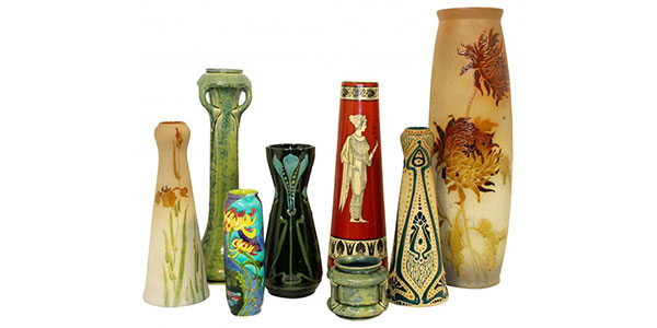
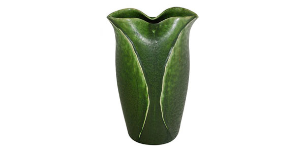
Art Pottery
Roseville Art Pottery Early Patterns and Artists
Since its incorporation in 1892, The Roseville Pottery Company operated under their general manager, George F. Young and produced pottery such as flowerpots, cuspidors, jardinières and pedestals as well as coin banks and novelties. In 1900, Young hired Ross C. Purdy...
Grueby Pottery Designers, Artists and Modelers
In the Grueby art pottery studio tasks were delegated according to talent and experience by company founder William Grueby. In the early years of the pottery, George Kendrick was responsible for design and production. As such, he supervised the throwers...
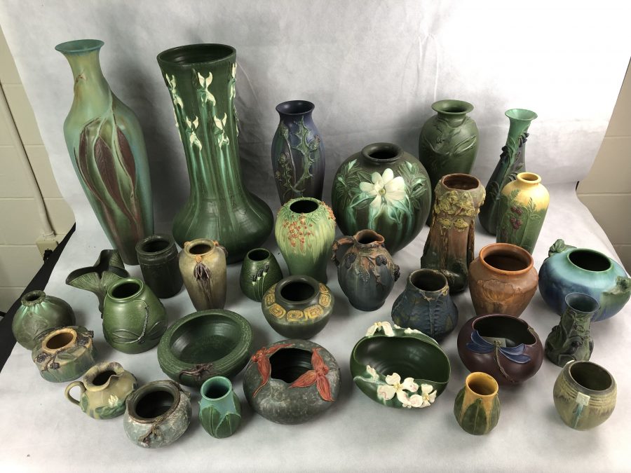
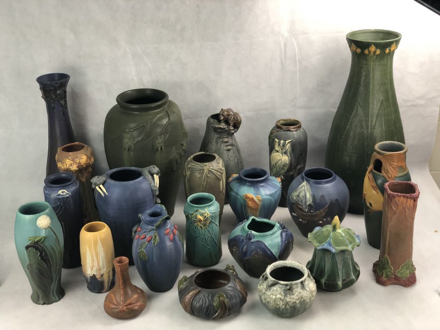
We Buy Ephraim Faience Pottery
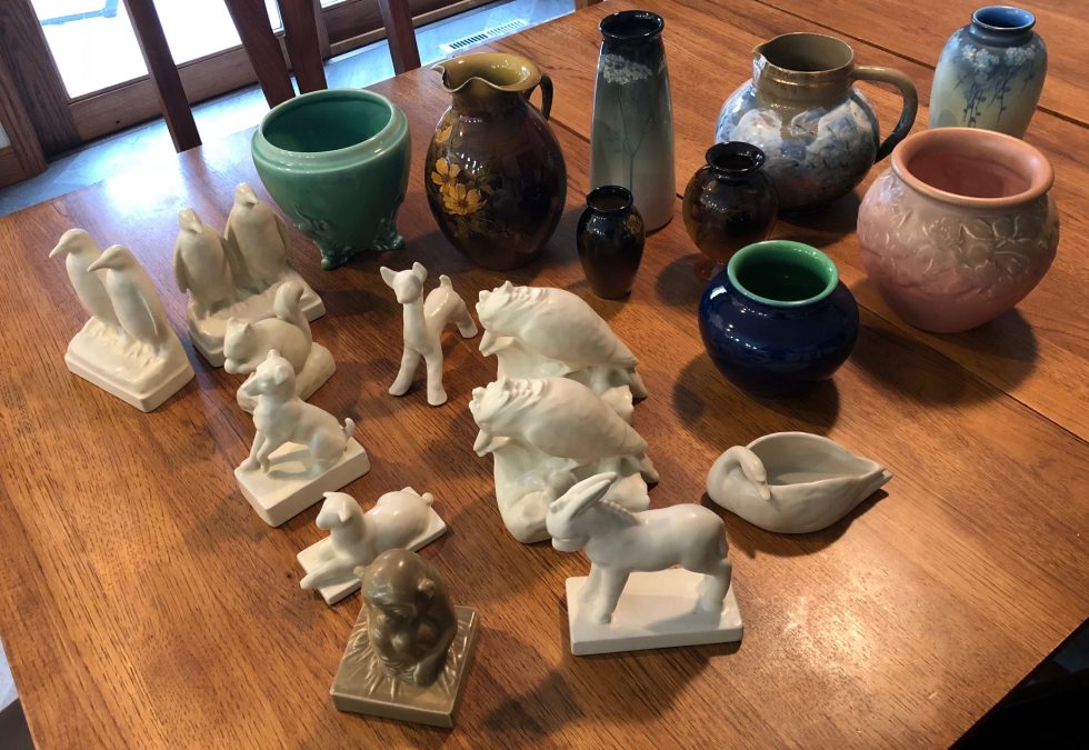
We have just returned from a pottery buying trip with another large single-owner collection of Ephraim Faience art pottery. This is a one owner collection that was assembled by selecting only the best examples of the pottery. All pieces are fresh to the market and...
Ephraim Faience Pottery Marks 1996-2000
The Ephraim Faience Pottery company was started by Kevin Hicks and Scott Draves in 1996. Unlike many contemporary art pottery makers, Ephraim Faience has typically used a fairly easy to understand and a fully documented system of markings to determine the age of...
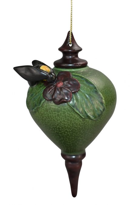
Ephraim Pottery Ornaments
One of the more unique art pottery items produced by Ephraim Faience Pottery is the holiday ornaments. Since 2011 Ephraim has produced a variety of limited edition, handcrafted and tooled Christmas ornaments. A sample of a few of the Ephraim Pottery...
Rookwood Art Pottery Collection
We just purchased this estate fresh Rookwood Pottery collection that includes some very nice paperweights, bookends, vellum, iris, limoges, and standard glaze vases by Lenore Asbury, Fred Rothenbusch, Matthew Daly and an exceptional standard glaze pitcher decorated by...
